
Table of Contents
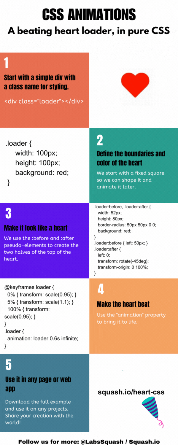
The code below generates a beating heart that can be used as a CSS loader, use it in web pages and web apps.

[bctt tweet="A beating heart (pure CSS) loader." username="LabsSquash"]
CSS Code
Preview and Download it here.@keyframes beating {
0% { transform: scale(1); }
50% { transform: scale(1.2); }
100% { transform: scale(1); }
}
.loader {
position: relative;
width: 100px;
height: 90px;
display: inline-block;
animation: beating 1s infinite;
}
.loader::before,
.loader::after {
content: "";
position: absolute;
top: 50px;
width: 52px;
height: 80px;
border-radius: 50px 50px 0 0;
background: red;
}
.loader::before{
left: 50px;
transform: rotate(-45deg);
transform-origin: 0 100%;
}
.loader::after{
left: 0;
transform: rotate(45deg);
transform-origin: 100% 100%;
}
Related Article: How to Right Align Div Elements in CSS
Diagram
Related Article: CSS Padding: An Advanced Guide