It now takes 5 minutes to review
our changes - without Squash it
would take hours”

Supports any tech stack
Squash supports any programming languages,
databases, caching, web server, etc.
If it runs on Linux it runs on Squash.
Integrates with


It now takes 5 minutes to review
our changes - without Squash it
would take hours”

Squash supports any programming languages,
databases, caching, web server, etc.
If it runs on Linux it runs on Squash.
Squash was designed from the ground up to support the most complex and modern web
applications of today and tomorrow.
Squash deployments are faster than regular development servers, more reliable and readily available only when you need them. One VM and unique URL per branch providing optimal test isolation.
Deploy complex applications using one or more microservices. Map each microservice port with a custom subdomain and access these services independently.
Demo different stages and versions of your application without the hassle of managing servers. Setup and store demo data and keep it intact between runs with persistent storage.
Easily create and deploy variations of the same branch and test them out in parallel and share with clients and stakeholders.
An extra layer of automation on top of your existing CI process. Each Pull Request gets its own automatic Squash comment.
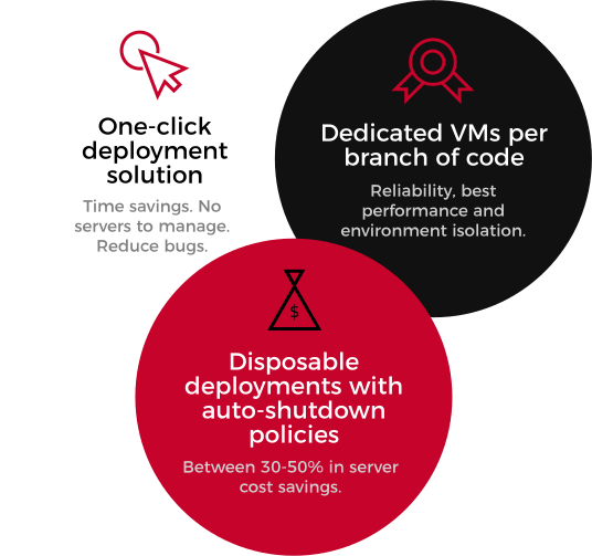
Reliability, best performance and environment isolation.
Pick from any pre-made VM sizes from 1GB to 64GB of memory. Customize the storage on each VM size to tailor your needs.
Multiple auto shutdown options to ensure a balance between optimal cost savings and convenience.
A unique IP address and SSH endpoint to each deployment.
Got product cover images, profile pictures, dev db dumps or any assets that you need to share between deployments? We've got you covered.

Stop wasting time with manual test deployments, provisioning servers, managing backups, security and debugging server specific issues.

Save between 30 and 50% on server costs. No more paying for test servers 24x7. Squash deployments stay active only when you need them, and the number of deployments can scale up and down automatically.

Not fully automating a test environment can lead to 2x more bugs, some of these bugs will hit production.

Squash allows development teams to spend more time developing high quality applications. Teams can now experiment earlier and iterate faster.
Managing development/QA environments is a hassle. Automation is key to reliable QA cycles.

Squash brings a critical layer of automation to your development process, making dev and QA teams more efficient.
More automation means faster and shorter release cycles powered by reliable QA cycles.

See our pricing details for
additional information.